In theory every app development process should allow the development team to create features that are accessible to all users.
When designers and developers create features, they usually first think about the user experience that is provided and how easy and intuitively that feature can be used. This usually accounts for a clear visual appearance and sticking to well known mobile interaction patterns e.g. icons, lists, pinch to zoom, swipe etc.
One thing that is often neglected is how the user interacts with the mobile device. This assumption is a natural one as the majority of people interact first visually and then by touch, but as we all know this is not always the case.
There are various reasons why a consumer may not be able to touch or look at the screen when interacting with the app, and we therefore need to keep in mind that our app will be accessed in many different ways.
By taking this into consideration when creating features, we allow a much broader audience to access our app by introducing a design that works for all of our customers regardless of their accessibility requirements.
When designing the Just Eat Takeaway.com app we took these accessibility considerations into account in both design and development, but there’s always some room for improvement. Here we’ll outline some of the improvements we made on one part of the app (in particular our menu module) and the tools we used to help us on Android.
Accessibility scanner app

We already made some accessibility considerations during the design phase, looking at touch areas, colour and fonts, but also during the development, adding in content descriptions which are used by the Android screen reader (Talkback).
The starting point for the improvements began with an app called Accessibility Scanner, that is free to download on the Google Play Store.
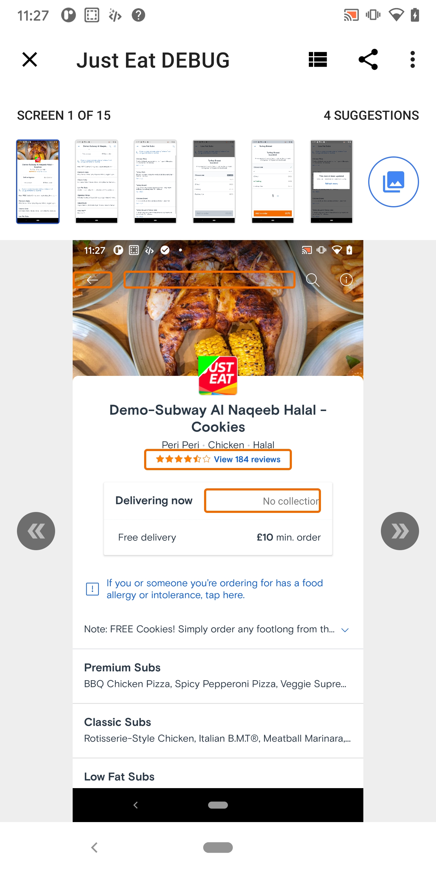
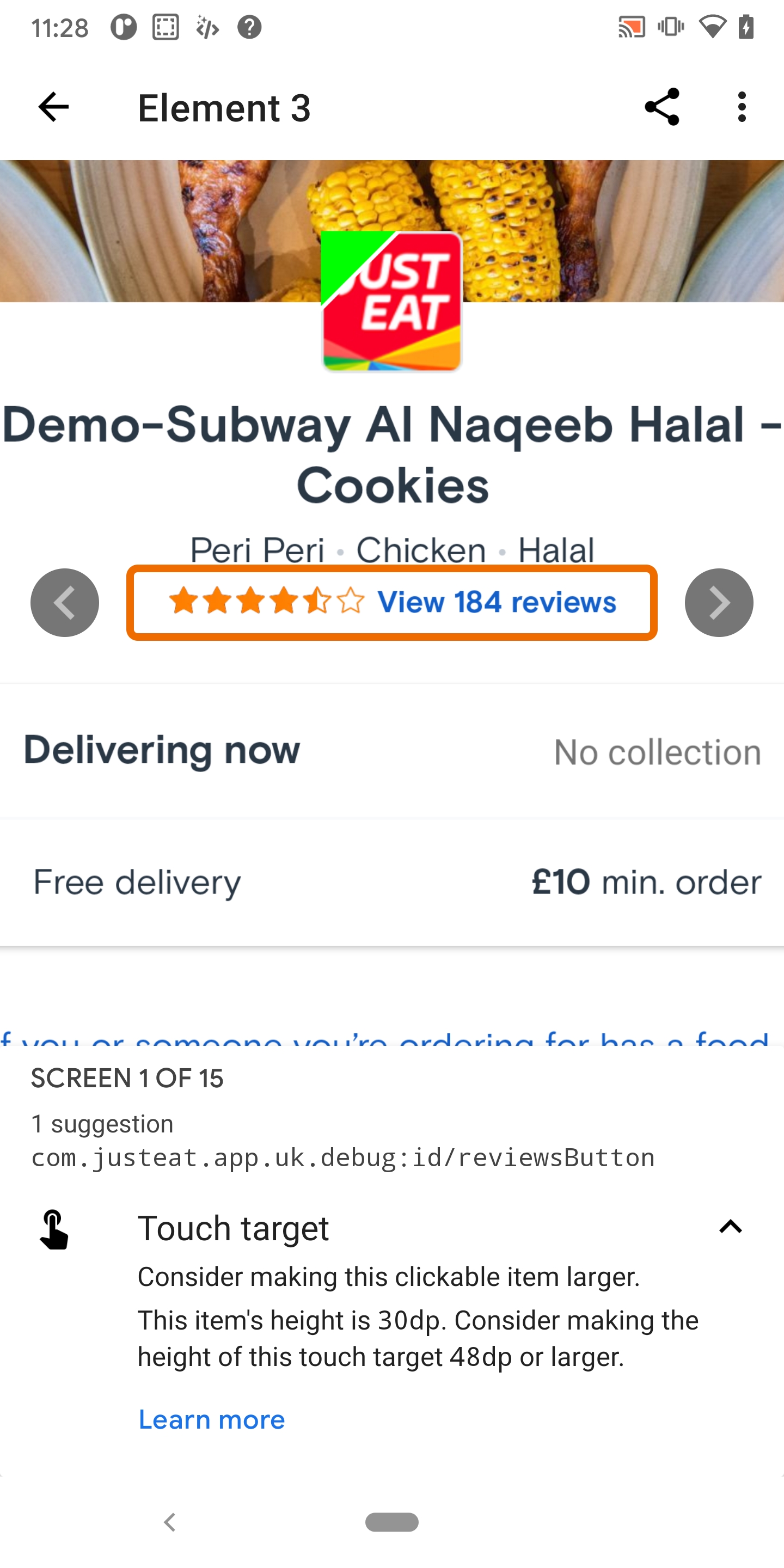
This is a great app provided by Google to allow app developers (or anyone for that matter) to review any app and assess how accessible it is according to Google’s guidelines. The app works by scanning the selected apps screen layout while you navigate through it and then produces a report at the end highlighting ways that you can improve accessibility with specific elements, like in the screenshots below. Tapping on ‘Learn more’ in the suggestions also links you to some great information on improving accessibility for that view.
Based on the feedback in accessibility scanner we were able to improve the following areas:
- Add missing content description (this is the text read out by the screen reader for each element on the screen e.g. buttons & images)
- Increase the touch target areas of buttons to meet minimums
- Change the app colours to meet requirements (contrasts etc.)
- Fix focus orders between elements
Content descriptions were added to views that were missing them by using the following view property.
android:contentDescription="@string/restaurant_logo_content_description"Or by adding a content description programmatically in cases where we need to dynamically build the string needed e.g. 3 out of 4 review stars, like the example below.
ratingBar.rating = String.format(resources.getString(R.string.rating_bar_average_content_description), ratingAverage)The touch targets on some buttons & views needed to be increased to match the 48dp minimum width/height by adding appropriate padding or margin (see the material design docs for more detail on this)
Changing the app colours was passed back to the app designers as further consideration needed to be made between changes in colours and branding. If you need to do this yourself there is a great website provided by Google that helps compare colours and assess whether they match accessibility constraints here.
Talkback

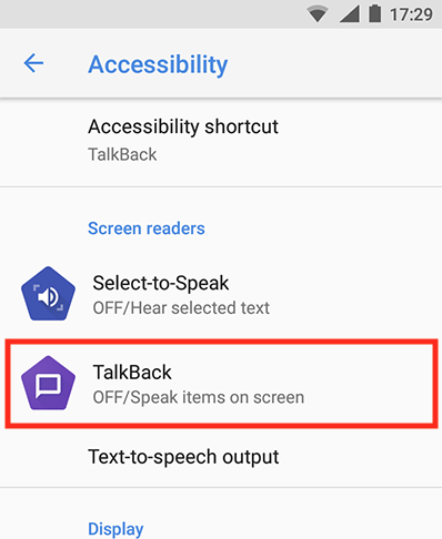
The second stage of the accessibility improvements involved turning on the built in screen reader in Android, called TalkBack, and testing how each screen is read out. (This can be found in the settings under, Accessibility > Screen Readers > TalkBack)
Navigating an app with the Talkback interface is a great way to empathise with people that can’t see the app and how they actually perceive the app experience.
Using Talkback
Before switching on Talkback it’s a good idea to know how to switch it off. If you’ve never navigated with it on, it can be challenging to get back to the setting to turn it off. I found this out the hard way, but eventually realised that there is a nice hardware shortcut.
Before you switch on Talkback in the device settings, toggle the option “Talkback shortcut” this will allow you to switch Talkback on and off by holding down both volume up and down for 3 seconds.
The next hurdle is navigating your app with Talkback on. The easiest way to do this is to swipe the screen left to right to move down the screen between elements (or right to left to go up). Double tapping the screen will then select a button or link.
Reviewing Talkback usage
Once we mastered using Talkback we used it to check that navigation between items made sense and the correct information was being read out to the user.
It also allowed us to improve the overall navigation order of focus between elements on the screen. For example, if the initial focus item on a screen was the back button, we could use something like the properties below to change this focus to another field.
android:focusable="true"
android:focusableInTouchMode="true"
We could also control the order of the focus between views on the screen with these view properties.
android:nextFocusUp="@id/name_text"
android:nextFocusLeft="@id/description_text"
...etc
We finished by double checking that improvements made to content descriptions after using the Accessibility Scanner app were accurate, when read out by the screen reader.
Further work
These two tools are a great start to improve app accessibility, but there is always room for improvement.
The main point that we came up with for future improvements was to integrate the use of accessibility tools into the development process further and use the Accessibility Scanner & Talkback apps with each feature we develop. In a recent canary version of Android Studio (4.2 Canary 8) they have also introduced the Accessibility Scanner features directly into the layout editor, which you can use to further integrate these checks into your process here.
Another really interesting area for our next stage of improvements is to review how our app can be navigated by accessibility Switches. These come in various different forms but essentially allow users to navigate between elements on the screen by pressing a switch (usually used by people with limited or no movement).
The focus order of the elements on the screen contributes to how well this works and also if your app relies on gesture navigation like swiping, this can cause problems if there isn’t a button to perform the equivalent action. There is a great article on this by Rebecca Franks on this subject here.
The Android platform is always evolving and accessibility is improving with it, so we aim to keep up to date with these improvements and also keep our app accessible to all. There is a really interesting improvement in Android 11 around voice commands in this tweet, that shows part of this progression.
The process of improving an app’s accessibility expands your view on the potential audience of users that want to use your app and allows your app to appeal to everyone. I hope that our further investigation into improving accessibility will inspire others to do the same.
Resources
If you are interested in improving your own app then there are plenty of resources available out there, but here are just a few that we came across.


Awesome read!
Great Work!
Comments are closed.