Before we start, you’ll notice I’ve named this blog part one – I plan to deliver a series of posts over the coming weeks, and this is primarily so you can see my progression and how my learning amplifies as I dig deeper into the topic of the minimal form. But, at this point you’re probably wondering what the minimal form is. So without further ado…
The minimal form (or single input field) is a new way to display and interact with form fields. It is essentially a single form field that switches and changes to suit the desired input once a user submits their information. It’s primary purpose is to simplify the form filling process, whilst keeping it engaging and less tiresome.
Here is a great example I’ve grabbed from the web, which outlines the concept in full.
These types of forms aren’t limited to capturing basic information like name, address or telephone number. They can be implemented to enhance the form filling process for far more complex information, such as credit card or payment information.
Furthermore, there are a few companies who are currently taking full-advantage of the minimal form to create engaging and easy form filling questionnaires, such as Typeform.
What’s the benefit for your users?
Sure, the majority of these forms dotted around the web are simply seen as nice to haves or delightful elements. However, there are certainly some initial wins from a user experience perspective when it comes to the minimal form, especially beyond first glances.
For example, the most tangible benefit of a minimal form would be for mobile devices. As you can see, I’ve included a screen that outlines the skeleton of a common mobile web form.
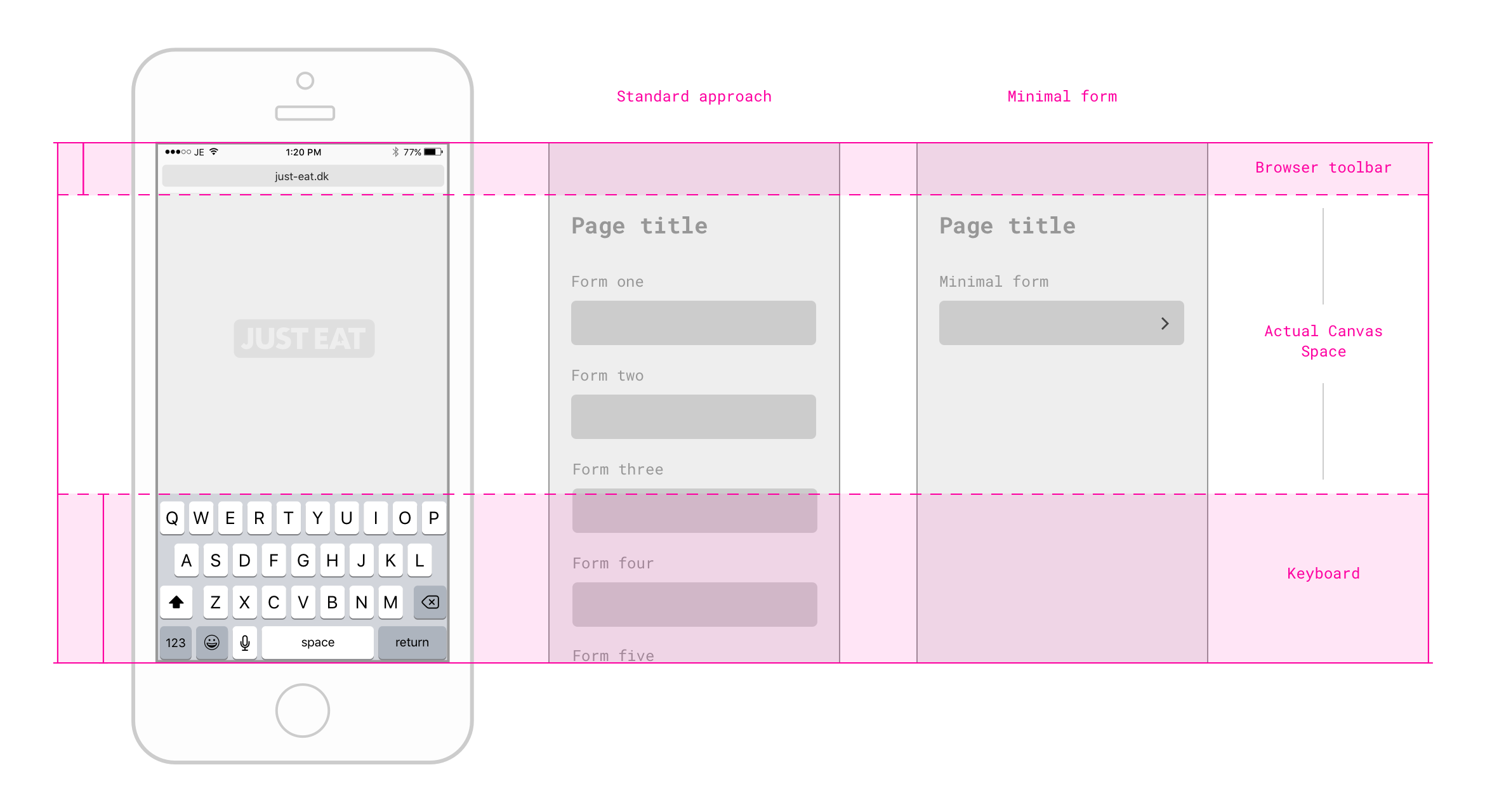
You can see the canvas space that designers have to play with, when they’re specifically considering form fields in the design process.
In 2016 it is considered common practice to simply collapse information to fit onto mobile. However, when you do this, spatial problems arise, and to maximise product objectives designers and engineers can minimise extensive clutter in multiple ways. For example, you can stack content below the fold, hide it amongst tabs, accordions or drawers. Ultimately, these solutions are seen as functional in most cases, which is great for mobile users across the web.
However, at JUST EAT, the UX team don’t just aspire to build experiences which are simply functional. As a collective team, we aim to build, explore and innovate these kind of experiences to help us empower our users to love their takeaway experience.
Ultimately, this means it’s our job to ensure we’re making experiences which are functional, reliable, usable, as well as pleasurable.
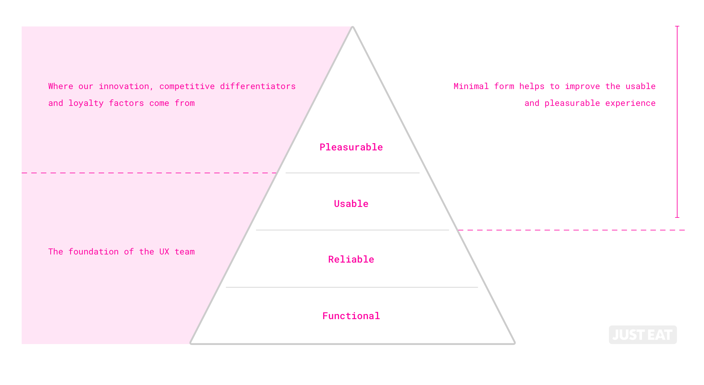 Subsequently, we’ve identified that minimal form is certainly an interesting area which could push the usable and pleasurable aspect of our product, whilst retaining that functional and reliable foundation.
There’s no denying that minimal form (for mobile, at least) has multiple benefits from a user perspective…
- It allows users to concentrate their effort on one form field at a time.
- Ensures the user is not overwhelmed with the sheer amount of information he/she may or may not be required to submit.
- No/minimal scrolling required.
- Less tapping/frustration.
- We assume it will be a quicker experience for our users – although, it would be interesting to see if this is the case via user testing. Perhaps it’s actually a longer process, but is perceived to feel quicker?)
An assumption might be, if you’re only focusing at one form at a time, would the information submitted be more accurate from your user base? We’ll dive deeper into the kind of metrics a minimal form could improve in part two…
Some disadvantages…
There are certainly some disadvantages to the minimal form concept. For example, how would you display an error state? Would a user have to go back if their password confirmation was wrong? Surely that would go against the progressive motion of the minimal form?
Furthermore, it’s great not having to see all of the forms you have to fill, but how would you check to ensure all of the information was correct before submitting?
Also, what place does the minimal form have on desktop? What tangible benefits does implementing a minimal form have for desktop users? And finally, how many people using this form for the first time will know how it works?
I’m confident that these are problems that can be solved when implemented in a user flow with a bit of intuitive design thinking.
Ok, so where would you start?
Well, you’ll have to stay tuned for part two where we look at implementing something similar to the minimal form as we continue to enhance our product, and help implement a more usable and pleasurable experience for all things mobile.