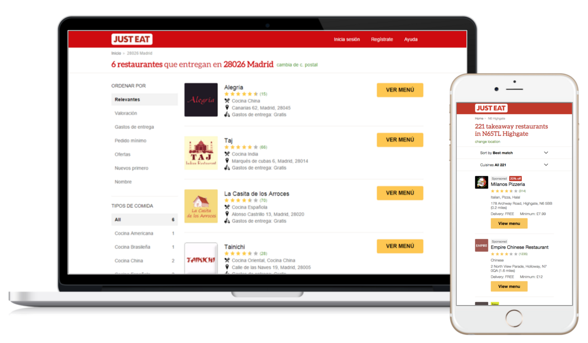
The benefits of moving JUST EAT International sites to a responsive web design are pretty clear. In a nutshell, responsive web design means that if a user switches between viewing your website on a Mobile device to viewing on a Desktop, the website should automatically adapt to cater for the different resolution. This is all achieved through things like CSS media queries and fluid grid layouts.
But, as well as the customer facing benefits, responsive web also provides efficiencies of scale from an engineering point of view – by moving to one common code base for all our international sites means we can develop features and enhancements more efficiently.
That said, rolling out a completely new version of a JUST EAT website is bound to cause some sort of nervousness and its down to the International Product teams to manage this to ensure that the countries feel confident about the change and supported at every stage.
As the Product Manager in the team that has rolled out responsive web in Denmark and is in the process of getting the Canadian responsive website live, I thought it was worthwhile to share the experiences I’ve had and the steps taken to make sure the roll out of responsive web was a success.
Gap analysis
The starting point is to identify the features or requirements for the country. Whether it be sales tax in Canada or integration with a specific delivery service in Denmark, the earlier you identify the unique requirements up front, the earlier you can consider them as part of your scope.
Story development and prioritisation
With our scope defined, we followed the principles of grooming the stories with the team and prioritising the stories based on what was the minimum required in order to get a beta version of the site ready and in front of staff to place real orders.
Automating the testing as much as possible
We created our acceptance criteria in the ‘given, when, then’ format, so the acceptance criteria could help form the basis of our Gherkin based feature files. Together these become our Executable Specification. We implement the feature files in .NET using SpecFlow and Selenium WebDriver to automate functional testing and identify regression issues more efficiently. Having experienced working in development teams where testing wasn’t automated, it can’t be underestimated how much time and effort can be lost without automation.
Stakeholder engagement
Once we’ve developed the responsive web version of the site that meets our MVP definition, we will demo the site to the country. These sessions are really positive as the countries can start to see the benefits that the new responsive website will give them.
After the demo, we will then get the ‘green light’ to launch the site to a group of internal staff members, eg beta and running through the process of collecting feedback
Establishing a phased roll-out approach
Our approach typically takes four stages, beta, 10% of customers, then 50% and 100%. Beta, involves launching the responsive website to a set group of internal staff from the country team, where we set up a feedback form for the country to feedback issues they’ve faced, or general comments. Moving beyond beta through to 100% of customers, is largely based on how quickly we resolve defects identified during beta.
Daily triage and defect prioritisation calls
When it comes to the point of trying to move from 10% to 50% to 100%, I’ve found it particularly useful to run daily triage calls with the country to help establish a priortised view of the defects and, most importantly, an agreed accepted level of outstanding defects before going to 100%. When you have this agreed target, it’s far easier to motivate everyone to reach that goal!
Analytics
Once we’ve gone live with beta, we verify that conversion events are being successfully recorded, but we are also make sure that we set up our reporting dashboards in advance so we can report back to the country about how the responsive website is performing versus the legacy website in each step of the funnel. Being proactive with this type of analysis also helps when pushing from 10% to 50% to 100%.
Efficient defect resolution
To ensure clarity and expected resolution for defects, I would discuss the detail of the issue with the country and replicate myself. Then, by detailing the current behaviour and expected behaviour of the issue, the dev team team were able to rattle through the prioritised defects and in the majority of cases resolve them first time. This quality output also helped to give the country team confidence that we would deliver against our promises and suggested ETAs.
Based on our experience with Denmark, from the start of the development process through to going live to 100% of all customers has taken 6 to 8 weeks. When you sit back and think about it, 6 to 8 weeks to roll out a completely new version of a fully functioning website across desktop, mobile and tablet, that’s pretty cool huh?! #minifistpump
I’d have to check with you here. That is not something I generally do!
I like reading a post that will make people think.
Also, thanks for letting me to comment!
Comments are closed.