Google announced material design in June 2014 and it’s essentially a set of design guidelines Google have created to enhance the user interface and user experience of android apps, responsive websites and even software.
It’s a well rounded and maintained document (found here: http://www.google.com/design) including principle guidelines for things such as grid based layouts, image preferences, typography, transitions, animations, static and animated icons, plus a whole lot more.
In basic terms, material design was created due to extensive design inconsistencies across Google products, and Larry Page (CEO of Google’s parent company, Alphabet Inc) took a top down approach to encourage Google to re-design all of their products, which created a mobile-centric shift in the company’s approach to design.
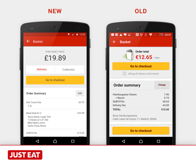
At JUST EAT, the international product development team are in the process of updating the android apps to include elements of material design.
Design improvements:
- Cleaner and clearer
- Simplification of typography
- Removal of skeuomorphic elements
- Clear information hierarchy
- Bold and clear CTAs (call to actions)
- Introduction of white throughout the app
You can also see our open source Android sticker sheets via: ux.just-eat.com
Material design encompasses the idea of layers. Every component sits on a particular layer; depending on your design, each layer holds a significant value in the hierarchy of information within the design, and within the development regarding transitions and animations.
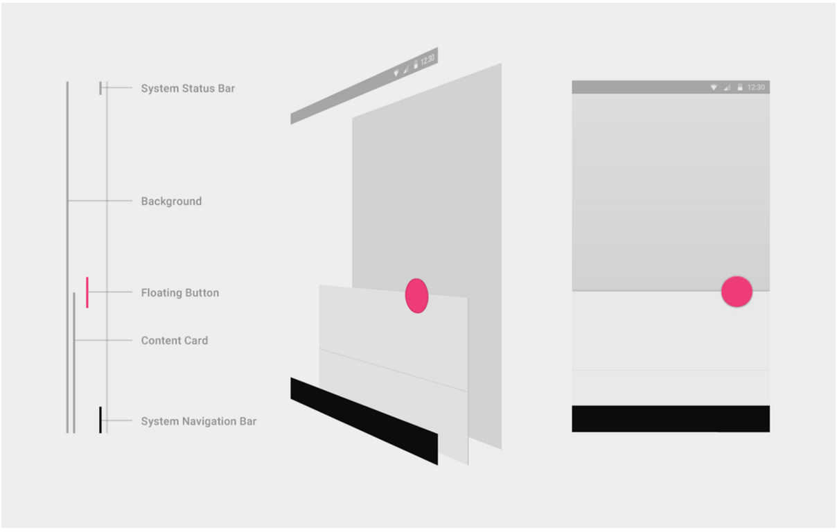
(Image reference: google.com/design)
Adopting these guidelines isn’t just an excuse for designers to create ‘cool’ or ‘nice’ design: The principles, meaning and significance which has been crafted into these guidelines hold a lot of weight for designers who want to create a lasting user experience which engages users in a consistent form across devices.
I think you’d agree, as the web now sits across an array of different devices such as: desktop, tablet, mobile and smartwatches, it’s becoming imperative to achieve a consistent user experience and retain a sense of familiarity through-and-through.
The card:
Material design helps with this by coming up with concepts which strategically consider the possibility of varying screen sizes whilst keeping the user at the forefront of the thinking. For example, the introduction of ‘cards’; although not directly invented by material design, they certainly play a strong role within the design patterns.
A card visually betrays itself as a physical object (via styling) which helps segregate content into digestible pieces as well as making them responsive across devices. (You can learn more about material design cards, here).
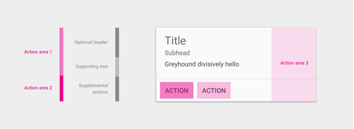
(Image reference: google.com/design)
The FAB:
Floating action buttons (FABs) are a great example too. The FAB concept, albeit one of the most controversial components to come out of material design, is primarily intended to make the most prominent actions the easiest to reach and the loudest on the page. For desktop they’re typically on the top right (depending on the design) and for mobile they’re usually bottom right to enable easy access for users as it’s closest to the user’s thumb.
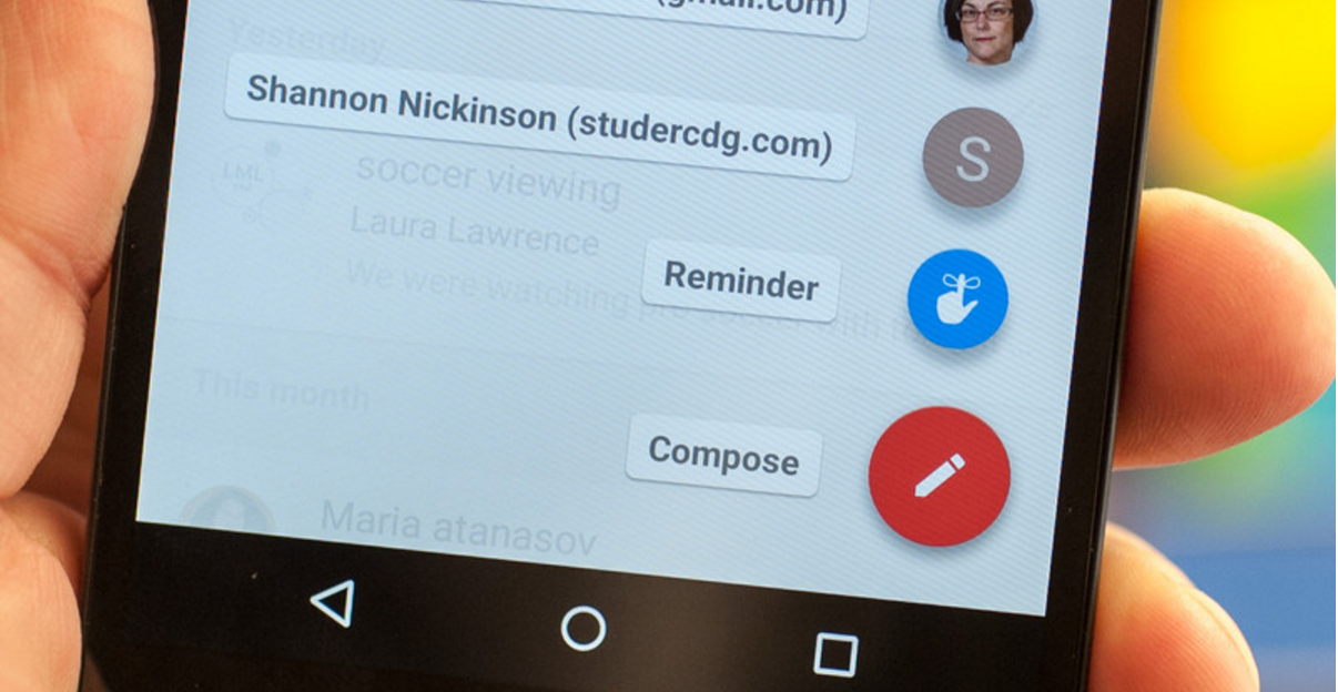
(Image reference: http://www.androidcentral.com/sites/androidcentral.com/files/styles/larger_wm_brw/public/article_images/2014/10/google-inbox-4.jpg?itok=uYsAr_mz)
You can learn more about material design’s floating action buttons, here.
There is a whole set of design components typically used throughout material design, so I won’t go through all of them, although, you can craft an idea about how much thought has gone into considering these components.
Transitions and animations:
The guidelines also give you all the principles to implement animations and transitions in a meaningful way. By that statement, I’m not referring to those endless parallax websites with 15 thousand lines of jQuery and JavaScript code holding it all together with 3D explosions which only work on Chrome. I’m referring to the guidelines which make it incredibly easy for designers to replicate the extremely lightweight, flat and meaningful transitions exposed within the design language to help integrate within your designs whilst contributing to an immersive user experience.
Again, you can learn more about material designs animation section, here.
One of the best features of material design is that it can be adopted onto any app or website. Regardless of the brand, this design language is flexible enough to be subtly implemented in ways which can optimise product objectives.
Sure, Google have shown off adverts of material design with web/apps displaying an array of exasperating bright colours, over-the-top transitions and of course, gimmicky music. This, of course helps for marketing purposes, which convinces designers like myself to initially take notice of their launch. However, once you’ve stripped this concept of all of its ‘trendy’ gimmicks and looking at its core principles for an effective and clean UX you’ll be surprised of its value not just for now, today but for user experience principles which will stick for a very long time.
Here are a list of useful and cool links which might spark further interest in material design:
https://design.google.com/
https://design.google.com/articles/evolving-the-google-identity/
https://design.google.com/articles/the-art-behind-android-marshmallows-new-wallpapers/
https://design.google.com/articles/expressing-brand-in-material/
http://www.fastcodesign.com/3046512/how-google-finally-got-design